

Scum City
Life is cheap in Scum City.
Former cop, Rourke, re-enters the neon nightmare of Scum City to avenge his partners death by taking down the ScumLord and his ruthless gang.
Kitchener, ON | Action, Art House
189 Followers
Mission #3: Poster
See Mission Brief

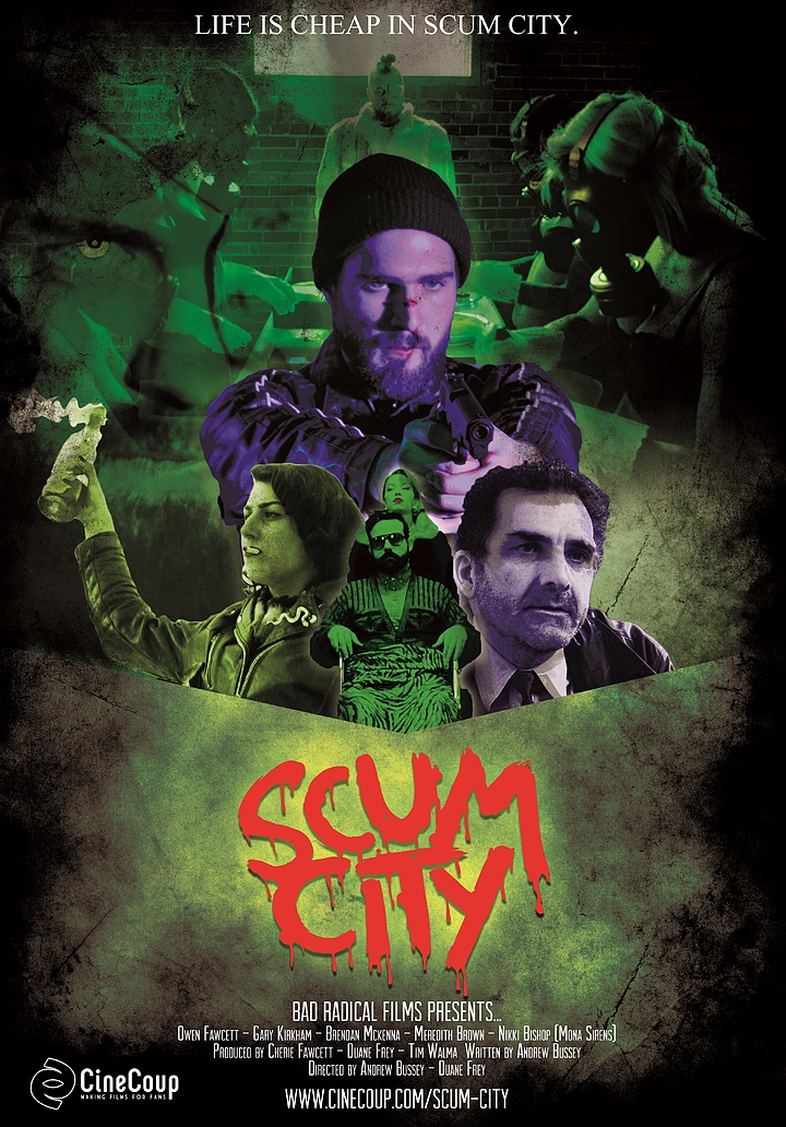


Scum City poster A, designed by Adam Frank. Scum City poster B, designed by Branko Vranic.
Missions

Mission #1 Trailer

Mission #2 Differentiator

Mission #3 Poster

Mission #4 Speechless

Mission #5 Conceptualize

Mission #6 Another Angle

See Top 15
See Final 5

Seth

The Sad Prince

Enthralled

Edith

Earthlickers

The Legend of Davy Crockett

Wasted

People for the Ethical Treatment of Zombies

Sassquatch: Return of the Queen

Nowhere Fast

Namas-DIE

Blurry Bits

Colt

High School Brawl

Pretty. Ugly.

Psychonaut

Playground Rules

Astral Haven

New Ventry

Generation O

Baby Face

A Western

Frackin' Zombies!

Black Land

Golden Bros.

The Necroslinger

Patient 62

The Last Canadian

Love at First Stab

The Slinger

Camp Death III: The Final Summer

Collider

Fantome

Fish Eye

Climax

Tales From The Castle Of Terror

Across All Galaxies

Hellmington

Henchmen

The Adventures of Porno the Clown

Hyde and Seek

The Wounded

Hypnotica The Nightmarist

Checked In

Arcade Death Zone

Postmen

Cupid

Gauntlet

Comic Book Wednesday

John Goes To The Olympics

Can Con

Advanced Wizards And Warriors

Nerd Nite

Wedding Season

Melvin and Tyler

The Visitor

Cognition

Pestis

Chrome Steel

Human Oil

DJ Duppy - The Reggae Zombie

Primordia

Blood White

Theories

The Cowboy

Belushi's Toilet

Sweetblood

Scales

Lucidity

Goons

Comments (31)
Poster B is badass and would look sweet on a shirt. I really love the design, colors and font used.
Cheers
Lovina
I picked Poster A. 16% of the votes.
Definitely poster "B" just thought it was better visually and the other poster looked too campy. Best of luck.
I loved the design for poster B right from the get go. Congratulations on making Top 60, I am very excited for you guys and for the project :)
Hello Scum City. I picked Poster A yesterday. I always vote with the minority of the crowd. Not sure why. Great design by Adam Frank.
Very Cool ..very creepy ....Lettering looks a bit stacked and could be modified slightly by scaling down skull
I love poster B. Especially the awesome skull graphic. Great work!
I think Poster B out of all the posters in the Cinecoup Film accelerator is probably the best one I have seen so far!
B for the win!!!
I picked B like the cartoon style, very iconic.
Report Comment
You are about to report a violation of our Terms of Service. All reports are strictly confidential.
We will NOT remove comments just because you disagree with the statement being made.
Reason for reporting*