
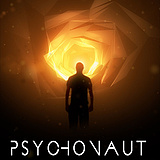
Psychonaut
The Mind Unleashed!
A futuristic Sci-Fi about Psychonauts who travel to the universe within.
Vancouver, BC | Sci-Fi
219 Followers
Mission #3: Poster
See Mission Brief


Week 3 we discover two unique posters conceptualized by Marc Nyiti. Make sure to follow us on Twitter(@Psychonautmovie) and instagram(@Psychonaut_movie) for all the latest updates and behind the scenes footage.
Missions

Mission #1 Trailer

Mission #2 Differentiator

Mission #3 Poster

Mission #4 Speechless

Mission #5 Conceptualize

Mission #6 Another Angle

Mission #7 Hype

See Top 15

Mission #9 Franchise
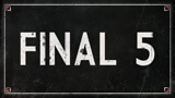
See Final 5

Mission #12 The Big Deal

A Western

Black Land

Cognition

Primordia

Camp Death III: The Final Summer

Postmen

New Ventry

Checked In

Sassquatch: Return of the Queen

Astral Haven

Hyde and Seek

People for the Ethical Treatment of Zombies

Frackin' Zombies!

Climax

Earthlickers

Hypnotica The Nightmarist

The Legend of Davy Crockett

Pretty. Ugly.

Seth

The Cowboy

The Adventures of Porno the Clown

The Visitor

Human Oil

Enthralled

Hellmington

Fish Eye

Cupid

Advanced Wizards And Warriors

Sweetblood

Baby Face

Arcade Death Zone

The Slinger

Collider

Edith

Wedding Season

Fantome

Chrome Steel

Nowhere Fast

Comic Book Wednesday

Goons

The Wounded

Theories

Patient 62

Blood White

Henchmen

Generation O

Can Con

John Goes To The Olympics

Belushi's Toilet

Namas-DIE

The Last Canadian

Melvin and Tyler

Lucidity

Playground Rules

The Necroslinger

Across All Galaxies

Colt

Blurry Bits

Pestis

Gauntlet

High School Brawl

Wasted

Tales From The Castle Of Terror

Scum City

Love at First Stab

Scales

The Sad Prince

Golden Bros.

Nerd Nite

DJ Duppy - The Reggae Zombie

Comments (34)
My pick was Poster B. 76% of the fans chose..
Very cool, I like this. The key hole is awesome, and I like the mask design. I like A more then B, but both are nice.
"B" looks like an original idea where "A" looks like the Clockwork Orange poster. As they say, Imitation is the sincerest form of flattery
I really like the visual simplicity and cohesive design on your B poster, it's intriguing and eye-catching, similar to your 1st trailer, poster A seems a bit cluttered, but with some interesting ideas. Great work all around though!!
I love the artwork in poster A.
Poster B has a nice trippy feel to it. Good work.
I prefer Poster B mainly because Poster A seems to borrow too much from A Clockwork Orange. I like that you identified the artists on the poster.
I love the one on the left so much. colors and font. good job. the one on the right is ok too but the A poster is the winner here i think.
thanks Stephanie!
Great posters, both. I like the one on the left, but apparently it's me and a few others who do.
I like the simplicity of the right/second poster. It leaves the lookers wanting more!
Report Comment
You are about to report a violation of our Terms of Service. All reports are strictly confidential.
We will NOT remove comments just because you disagree with the statement being made.
Reason for reporting*