

Scales
Iguana be kidding me!
A down and out whiskey-swinging, gun-slinging, trumpet-ringing reptile trying to make it in the big times.
Montréal, QC | Art House, Comedy
168 Followers
Mission #3: Poster
See Mission Brief


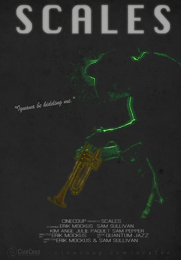

these are posters — posters inspired by second hand books on dusty old shelves.
Missions

Mission #1 Trailer

Mission #2 Differentiator

Mission #3 Poster

Mission #4 Speechless

Mission #5 Conceptualize

Mission #6 Another Angle

See Top 15
See Final 5

Psychonaut

Melvin and Tyler

Gauntlet

The Wounded

Blood White

Across All Galaxies

Edith

Namas-DIE

Hyde and Seek

Nowhere Fast

Colt

Advanced Wizards And Warriors

Lucidity

High School Brawl

The Visitor

Climax

DJ Duppy - The Reggae Zombie

Fish Eye

Seth

The Last Canadian

Collider

Enthralled

Camp Death III: The Final Summer

Baby Face

Henchmen

The Adventures of Porno the Clown

Scum City

Arcade Death Zone

Pestis

Goons

Patient 62

Cupid

Love at First Stab

Pretty. Ugly.

Checked In

Primordia

Comic Book Wednesday

Human Oil

Hellmington

Frackin' Zombies!

A Western

Generation O

Earthlickers

Chrome Steel

New Ventry

Sassquatch: Return of the Queen

Postmen

The Slinger

Belushi's Toilet

Playground Rules

The Legend of Davy Crockett

John Goes To The Olympics

The Necroslinger

Wasted

People for the Ethical Treatment of Zombies

The Cowboy

Fantome

Blurry Bits

The Sad Prince

Hypnotica The Nightmarist

Cognition

Black Land

Wedding Season

Theories

Golden Bros.

Sweetblood

Astral Haven

Tales From The Castle Of Terror

Can Con

Nerd Nite

Comments (35)
I liked poster B. Its mysterious and has my fave color combos. Black and lime green. Reminds me of Alien.
Nice job!
Cheers
Lovina
Poster A
I picked Poster B. 43% of the votes for this mission.
simple and clean. I dig poster B. Like the color choices.
I really like how simple both of these posters are. I think they're both good. Good luck on your project.
A little bit dull I terms of color and texture Would be nice to have some vibrancy in at least part of the image.
I like A. More mysterious, and fun!
B all the way
Neither poster is distinct enough to catch the eye. Poster B, however, offers an interesting use of colour.
Poster A is nice and simple and strongly suggests the musical theme. The green outline from on B is a bit ambiguous.
Report Comment
You are about to report a violation of our Terms of Service. All reports are strictly confidential.
We will NOT remove comments just because you disagree with the statement being made.
Reason for reporting*